
CLIENT
PROJECT
RE-UP
SUMMARY
This case study highlights the design system I developed for Cancer Research UK (CRUK) to enhance the accessibility and flexibility of their Donate Thin Slice, a key section of the site responsible for driving donations. As the lead designer, I worked to create a scalable, intuitive system that aligned with CRUK's new brand guidelines while supporting content creators’ needs.
RESPONSIBILITIES
UX Design Lead
A CIRCULAR FASHION FUTURE
Recomme’s Re-Up initiative seeks to address one of the fashion industry’s most pressing challenges: the environmental impact of textile waste. With millions of tons of clothes ending up in landfills each year, Re-Up set out to create a sustainable solution by recycling clothing through fashion brands' existing channels. The goal was to design a user-friendly platform that facilitates the recycling process for customers, operators, and brands.
Partnering with a UK-based recycling facility, Re-Up aimed to build an end-to-end solution: a customer-facing platform to make recycling easy, an operator platform for managing the recycling process in the facility, and a dashboard for brands to track recycling efforts. The project started as a proof of concept (POC), testing the feasibility of integrating this solution into fashion brands' existing websites.

THE PROBLEM
VALIDATING POTENTIAL
Re-Up faced multiple challenges that needed to be addressed in the POC phase to determine whether the idea could scale effectively:
User Engagement: Customers are often unsure how to recycle their clothing or lack the motivation due to a complicated process. Re-Up needed to design an experience that made recycling simple, convenient, and rewarding to encourage participation.
Brand Integration: Re-Up required a white-labeled platform that could seamlessly integrate into existing fashion brand websites. This solution had to be non-disruptive, user-friendly, and scalable to cater to multiple brands.
Business Viability: For the solution to work long-term, Re-Up needed to prove that the platform could drive engagement and that brands would adopt it as part of their sustainability efforts. The POC would need to demonstrate user interest and business viability for scaling.
THE PROCESS
UNDERSTANDING USER & BUSINESS NEEDS
My initial research involved understanding both the user and business needs. I conducted user surveys and competitive analysis to determine key pain points and opportunities.
The research showed that customers wanted a simple, transparent, and rewarding way to recycle clothes. Users were hesitant to engage in recycling programs due to unclear processes or distrust in the impact of their efforts.
For brands, integrating a recycling program into their websites had to be effortless. The solution needed to feel like a natural extension of their brand experience, without requiring significant technical or operational investment.
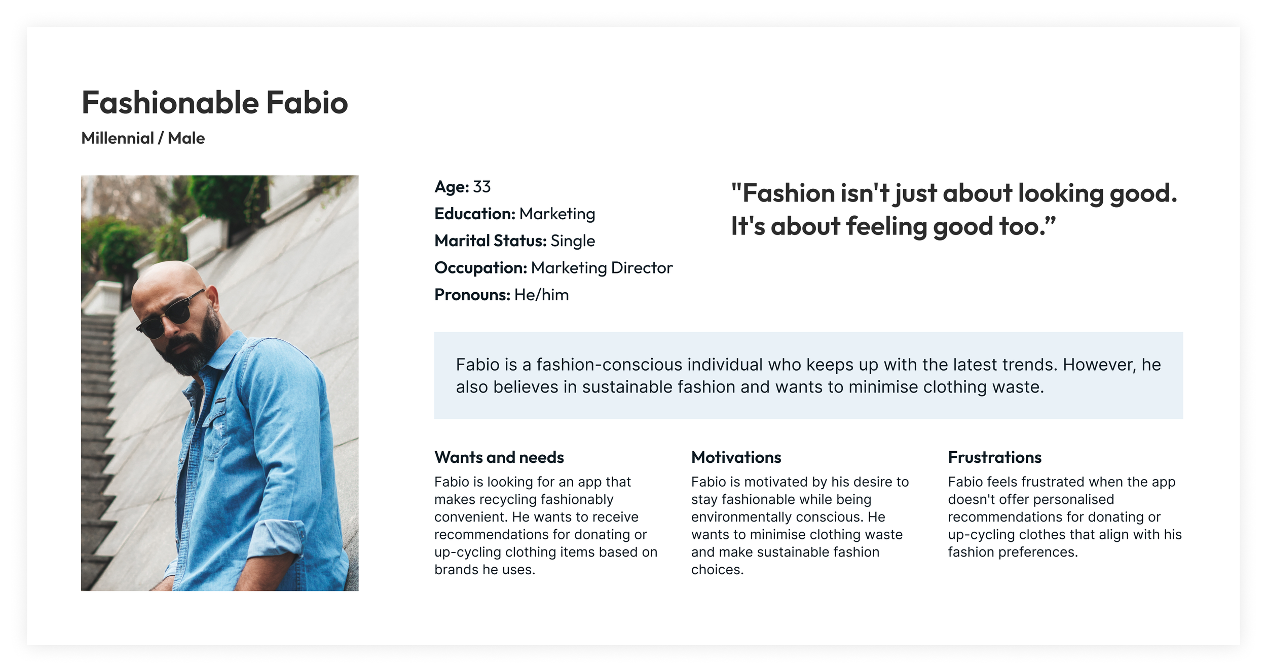
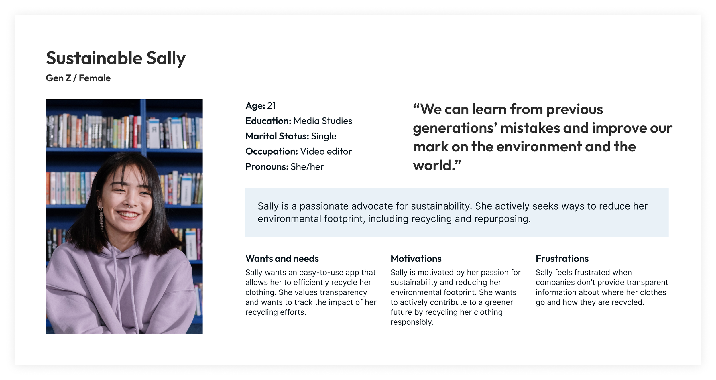
PERSONA-DRIVEN DESIGN
With limited time to conduct in-depth user research, I created provisional personas based on the available data and industry knowledge. These personas were further validated during usability testing sessions.
I also mapped out the user journeys for each persona to ensure that the app’s flow would align with users' expectations and reduce friction. By examining the process from the customer’s perspective, I identified the key steps needed for a smooth experience.

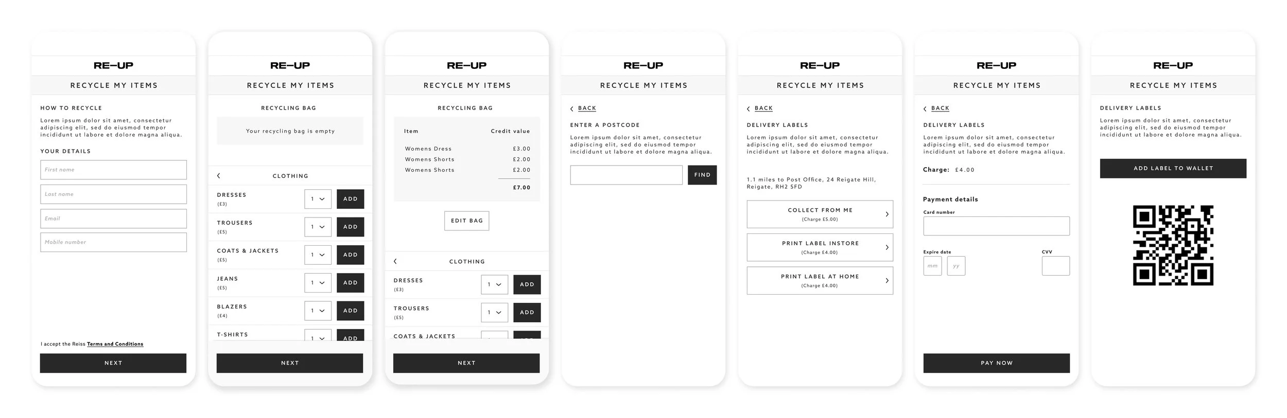
DESIGN & PROTOTYPING
Once the user flows were mapped out, I moved on to creating simple designs that outlined the basic structure of the app. These designs were then turned into interactive prototypes, which were used for early-stage usability testing.
The key focus during this phase was to create a simple and intuitive user experience that minimized friction at every touchpoint.
USER TESTING
I then conducted 3 rounds of usability testing to validate the app’s functionality and identify areas for improvement. One key insight emerged during testing: users were frustrated by having to provide personal details at the beginning of the process. Based on this feedback, I reversed the order of the steps, allowing users to select items for recycling before entering their details. A/B testing this new flow resulted in 89% of users preferring the revised order.
Another concern was around greenwashing (the misleading promotion of environmental efforts). To address that, I introduced a FAQ section that provided detailed information on the recycling process and the environmental impact of each user’s contribution. This transparency helped build user trust.
Finally, I introduced a gamified carbon offset tracker that visually displayed the environmental benefits. This feature significantly boosted user satisfaction, increasing from 20% to 65% after its inclusion.

THE RESULT
PROOF OF CONCEPT WITH REAL-WORLD INSIGHTS
The POC phase proved that Re-Up’s solution could address both user and brand needs effectively, with the following outcomes:
User Engagement: The platform saw a 68% completion rate in the recycling process, exceeding expectations for an early-stage prototype. Users appreciated the transparent carbon tracker and easy-to-follow steps.
Brand Adoption: Several brands expressed interest in integrating the white-labeled platform into their websites, validating the business model. The ease of integration and seamless user experience were key selling points.
Business Viability: The POC demonstrated that the platform could drive engagement, with over 30% of users completing the recycling process after initiating it. This was a strong signal for Re-Up to pursue a wider rollout.
KEY TAKEAWAYS
FAST ITERATIONS, TRUSTED SOLUTIONS
Rapid Iteration is Crucial: Given the fast-paced nature of the project, constant iteration and user testing were vital in shaping the app into a successful proof of concept.
Transparency Builds Trust: Clear communication about the sustainability process, including how items are recycled and their environmental impact, was essential in winning user trust.
Gamification Adds Value: The addition of a fun, quantifiable element (the “tree counter”) not only improved user satisfaction but also reinforced the environmental impact of recycling, leading to higher engagement.
FINAL THOUGHTS
PAVING THE WAY FOR SUSTAINABLE FASHION
The proof of concept has successfully demonstrated the potential for Re-Up to drive both user engagement and brand adoption. By validating key assumptions and learning from initial user feedback, we’ve established a strong foundation for the next phase of development. The project has shown that a seamless, white-labeled platform for recycling is viable and can help fashion brands fulfill their sustainability goals
NEXT STEPS
SCALING SUSTAINABILITY WITH FASHION BRANDS
Identifying First Clients: The immediate next step is to partner with a select group of fashion brands. By working closely with these initial clients, Re-Up can ensure a seamless integration of the recycling platform into their websites. This collaboration will also provide valuable insights into any unique brand-specific needs that should be addressed for future scalability.
Collaborative Integration: With early adopters, the focus will be on creating a tailored integration process, ensuring that the platform fits seamlessly into the brand’s existing ecosystem and enhances their user experience without disrupting their current systems.
Iterating Based on Feedback: The Re-Up product will be impacted as real user data becomes available. This will allow Re-Up to improve the platform's usability and effectiveness before scaling it further.
Expanding Partnerships: After the integration with the first clients and refining the product, the goal will be to expand to more brands and larger user bases, solidifying Re-Up’s place in the sustainable fashion ecosystem.
Re-Up Vision and Long-Term Goals: Moving beyond the POC, the next phase will involve bringing the vision of Re-Up as an end-to-end recycling platform to life.
VIEW NEXT PROJECT
